 News Via EmailNews Via Email
 Posted on Wednesday, March 11, 2015
Visitors to school websites often require quick information while on the go - checking times of events, school meals, and plans for trips out are just a few examples. While getting their kids ready for school or while they are out and about, enabling parents and guardians access to information in an easy to read format is vital. They now need this information so it can be read on their mobile device, thus reducing the calls to reception, and reducing requests for information. It’s about making the information on your website accessible and enabling it to really work for the school and all the stakeholders. The user benefits of a mobile-friendly website also contribute positively to a school's Ofsted examination.
But why has it all ‘gone mobile?’. To get a little context on why a responsive website is a vital tool for schools it’s best to look back a few years.
For the Personal Computer (PC) Market 2012 was a very unusual year. PC sales for were lower than the previous year for the first time in a decade.Consumers had been buying other devices - tablets, and smartphones at the time - all now devices of choice for the hungry internet audience out there.
I'm sure if you’re reading this you’ve been aware of the growth for some time now, but in 2015 it now looks like tablet sales will finally surpass the sales of PCs.
Steve Jobs predicted this, and according to Gartner his prediction will come true this year. Smartphones of course are also exponentially rising in popularity and sophistication, and research shows that it’s only going to increase, in the UK and globally over 1 billion people will access the internet on a mobile device. But not everyone can predict where this is going to go – the venerable Mr. Jobs also said Apple would never produce Phablets …but they do now, and they’re big sellers for them.
The shift to mobile is happening at an extraordinary speed (even Mr. Jobs couldn’t predict it). Today, 50% of some of our clients’ traffic is mobile. By the end of next year, we expect to exceed this figure considerably across the board - especially for schools.
The solution, of course, is to make a website that works equally well on every device. This is where responsive web design comes in.
In simple terms, we develop a responsive web design to be ‘intelligent’; when someone visits your website, it actually figures out the resolution on their device though identifying the type of browser it is using.

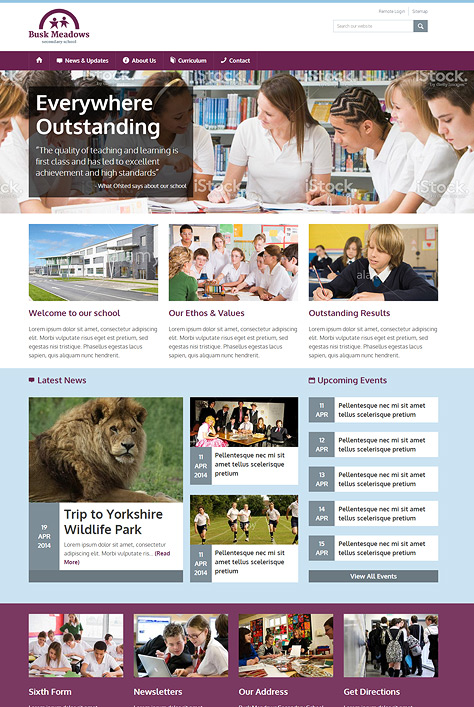
Over the past couple of years, responsive design has been adopted by some of the largest organisations, as they have realised the benefits. Time Magazine was one of the first examples, as are the Westfield School and Sandal Magna websites site developed by us and many others in our responsive website portfolio.
If you’re at a desktop PC, open the sites on your browser, and make your browser window smaller.This simulates the effect of the responsive design, flexible images and ‘fluid’ grids which size correctly to fit the ‘screen’.
The benefits are obvious - you build a website once, and it works seamlessly across thousands of different screens.
The rapid adoption of tablets and smartphones and the usage habits of stakeholders and consumers make it inevitable that responsive design will continue to be a major requirement of schools in 2015. It offers the simplest and most cost effective way to reach visitors across multiple devices and it ensures a great experience on every screen.
We were one of the first agencies to develop responsive websites on the popular open source platforms, including WordPress, MODx and Joomla for some global brands, but responsive design is not just for the big budgets…
We’ve developed a way of working and specific technologies that enable us to make responsive web designs both cost effective and easy for you to understand and implement on your website.
If you’d like to know more about responsive website design, contact Richard, Ian or Marc at EdHQ. Between us we have 60 years experience of working within education and delivering creative projects.